Church signs and wonders: a spotter's guide to a great American tradition
It's a small-scale phenomenon in the USA, and one appreciated far beyond the boundaries of the Christian subculture. Church signs are a familiar landmark in towns right across the country, and while for the most part they're just intended to display the service times and pastor's name, a maverick contingent of witty church staff often subvert them to impressive effect. Rather than using them to advertise Sunday's upcoming sermon, some churches use this blank public canvas to impress and amuse passers-by... and perhaps even entice them inside.
The diversity of slogans used on these signs is impressive, and for the most part, displays a fairly attractive command of wit. The authors don't always get it right however, as some of the examples below prove. Here's a rough spotters' guide to the weird and wonderful world of church signs – a national phenomenon with global appeal.
1. Mixing gentle comedy, fire and brimstone
One of the most popular running themes among these signs is a warning about hell. What's odd is that, given they regard hell seriously enough to put it on the advert for their church, they generally also couple this with a pun or other mild witticism. It's all a bit casual if you ask me; where else but a church lawn would you find people making light of eternal conscious pain?

2. Culturally relevant
Another important function of the church sign is to demonstrate that the minister is up with the times. More recent signs have made reference to catching Pokemon and the trinity-illustrating fidget spinner, but this one comes from a time when it was super-cool to name check the boy wizard, even when you thought he was a gateway to the demonic. It's from 2015.
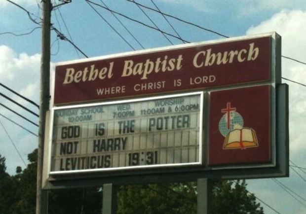
3. Gags which over-reach
As any comedian will tell you, there's nothing as painful as dying on stage. The author of this almost-there witticism demonstrates that it's also possible to die on a church sign. Too clever. And yet at the same time, not quite clever enough.
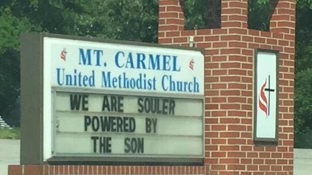
4. Jokes that make you look twice
By contrast, some signs are so clever that they have you reading them several times to make sure. This example – which also subtly plays on the American love of good quality meat – plays the old typo-in-a-line-about-typos trick, although there is just the tiniest possibility that the writer was just hungry and genuinely mis-spelled it. In which case it's possibly even better.
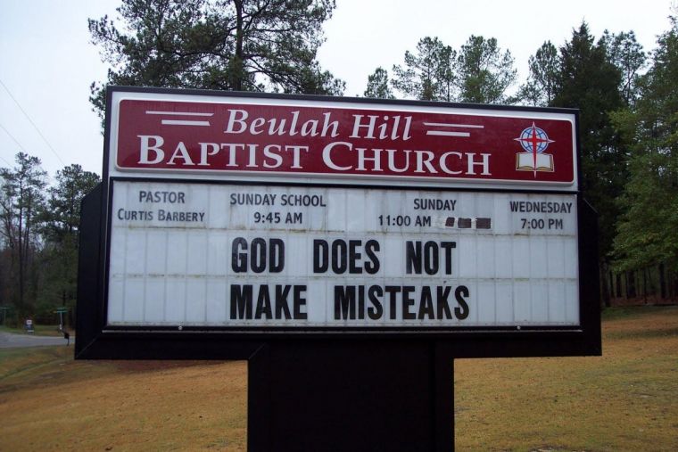
5. Passive aggressive signs
Occasionally sign-writers use their canvas to fulfil a different purpose, as in this case. What I love about it though is that they still manage to squeeze in one of those hell-references AND make light of the whole thing. Whoever wrote this one is a seasoned pro.
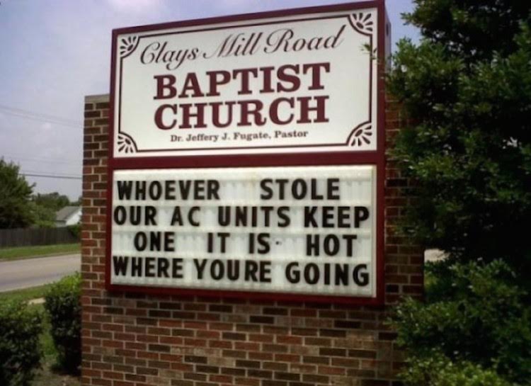
6. The high-risk strategy
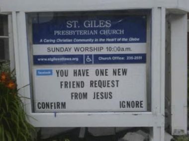
I suppose the whole idea of an individual's Christian faith is built on a moment of decision which can obviously go one of two ways. But while this church's commitment to the idea of free will is admirable, wouldn't it be better to invite people into the church to hear a bit of persuasive evidence before you invite them to 'ignore'? Kudos for the cultural relevance though.

7. The ones they didn't think through
The Internet loves these – the church signs which prove you should always read everything you write back at least once. Other favourites include 'Want to know what hell is like? Come hear our pastor preach', and 'Adult movie night: Passion of the Christ'.
8. Niche interests
This church almost certainly has a Trekkie pastor, or otherwise a very autonomous Trekkie sign writer. Either way, while this might appeal to people who know what 'Ferengi' are, it otherwise makes the church feel like a strange place full of weirdos with unusual interests. And let's face it, most churches don't need any help with that.

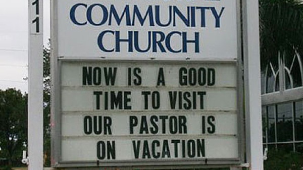
9. Refreshing honesty
Don't think they didn't think these through. Signs like this one not only demonstrate a refreshing lack of over-reverence for the church's leader, they're also almost certainly a self-deprecating joke. For what it's worth, I'd probably pop in and pay this one a visit.
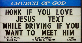
10. Community service messaging
This popular message has sprung up on church signs across America from time to time, and actually creates a useful practical application for the board. Impressively though, it still manages to squeeze in a reference to eternal consequence AND make a joke at the same time. Ironically, driving by and laughing at this sign could theoretically be the catalyst for a fatal car accident.
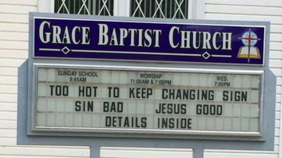
11. The cop-out
It must be exhausting having to continually come up with new phrases to fit on the sign, especially where you live in a place where it's 100 degrees outside. Sometimes you just have to fall back on honesty and simplicity, as this sign demonstrates.
Eleven wonderful examples, and we've barely scratched the surface. As a UK resident I'm envious of this marvellous American phenomenon, and eager to see it replicated in Europe too. Writing articles for Christian websites is pretty fun I suppose, but the church sign is surely one of the highest forms of literature; some of the authors represented above show flashes of true genius. I wonder if they ever encourage someone to actually enter a church building as a result...
Martin Saunders is a Contributing Editor for Christian Today and the Deputy CEO of Youthscape. Follow him on Twitter @martinsaunders.


